The Well Told Story
While talking to Professor Glover in my vision for my digital project, she gave me the term “interactive poetry book” as a descriptor. This helped me to conceptualize a digital space that pairs image and poetry in the same way that The Sweet Flypaper of Life and The Sweet Breath of Life does.
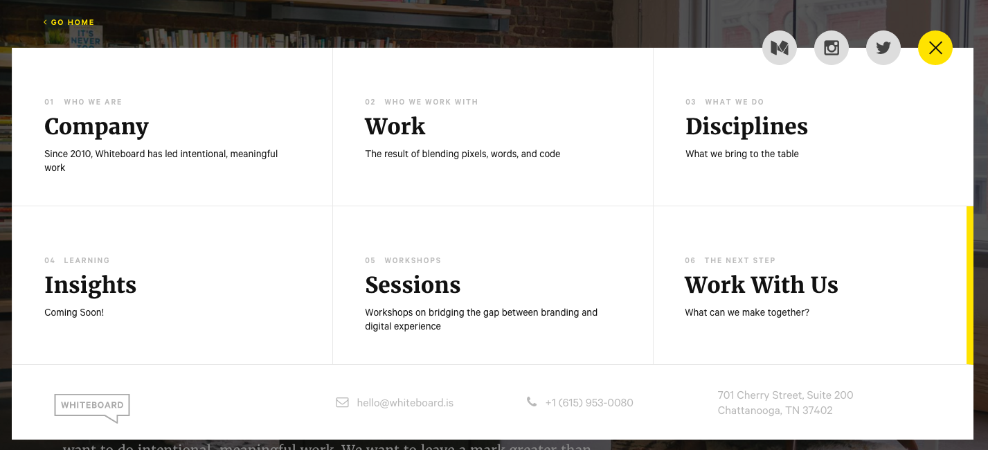
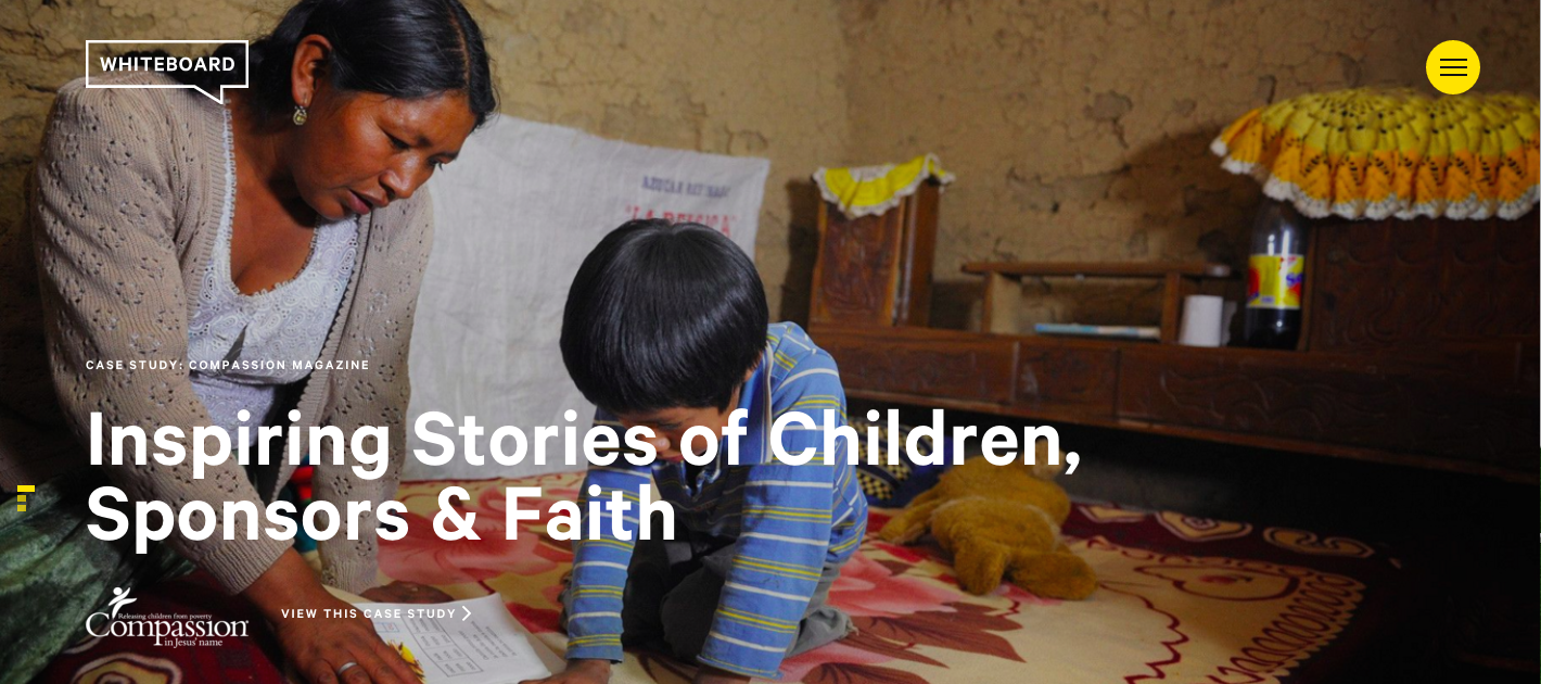
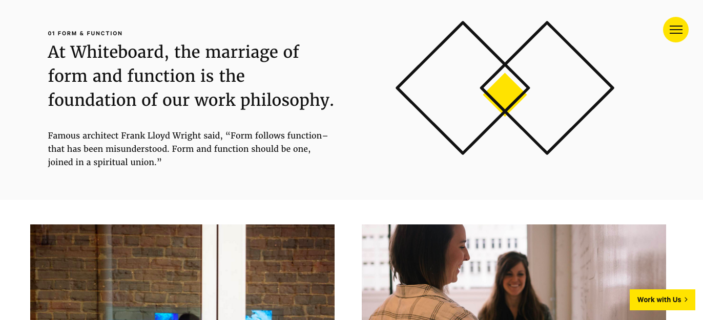
I did some browsing on the internet for sites that replicate the kind of effect I would like my digital space to have and I came across http://whiteboard.is/work/. I think this site works because it is user friendly and the transitions between images as I scroll are very smooth.
The background of the homepage is a looping mini-film. This gives the site dynamism as a first impression. If the technology allows it, I would like to have a looping mini-film of my Oshun dance as the introduction to my portion of the digital space.
The text on the site is bold and minimal while the images in the background take the lead in capturing and maintaining my attention for more than a few seconds.
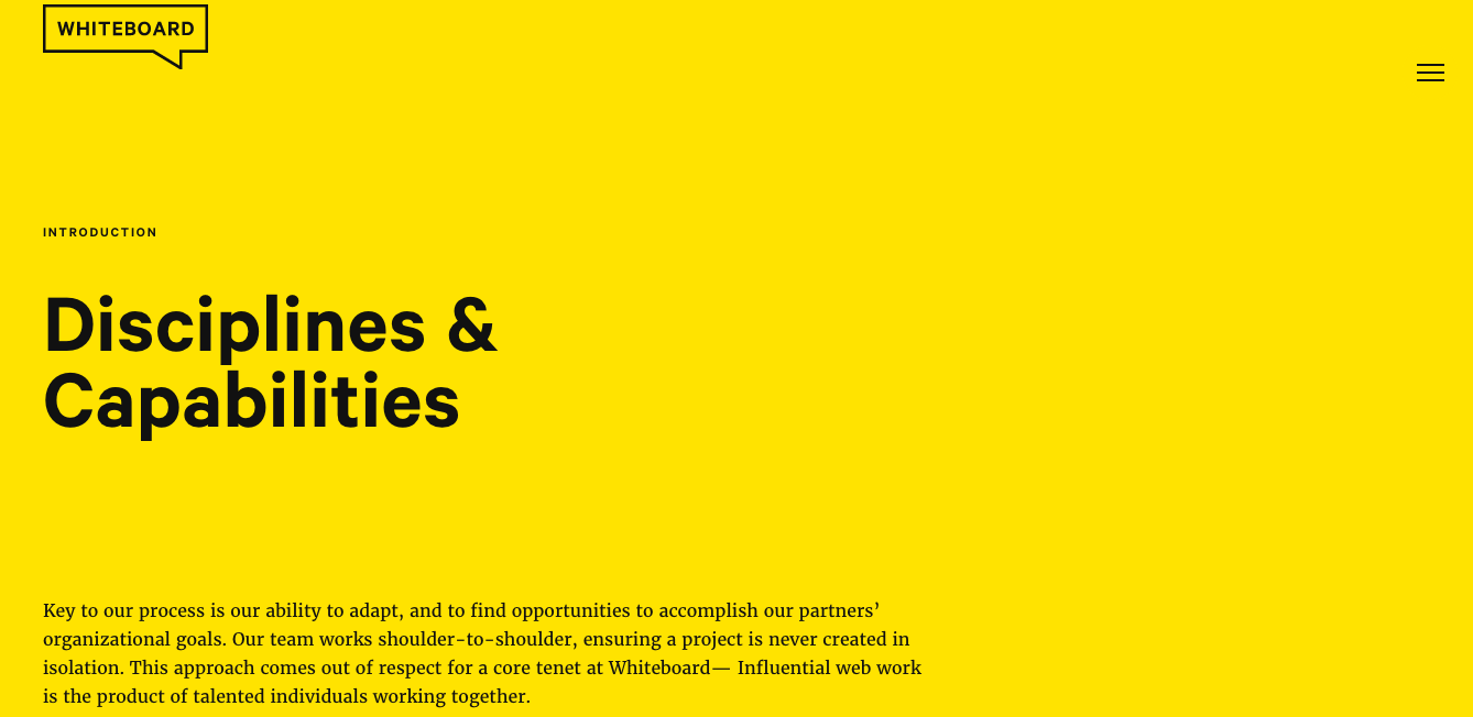
In the absence of images, they backgrounds are bright, solid colors to bring my attention to the words.
I also like how this site makes use of image, text, composition and design to create the aesthetic below.
I will draw inspiration from the elements of this site when curating my digital space.


Comments ( 2 )